Amrita Sher-Gil Palette 4

Palette Analysis
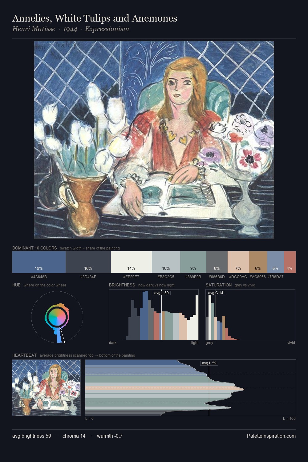
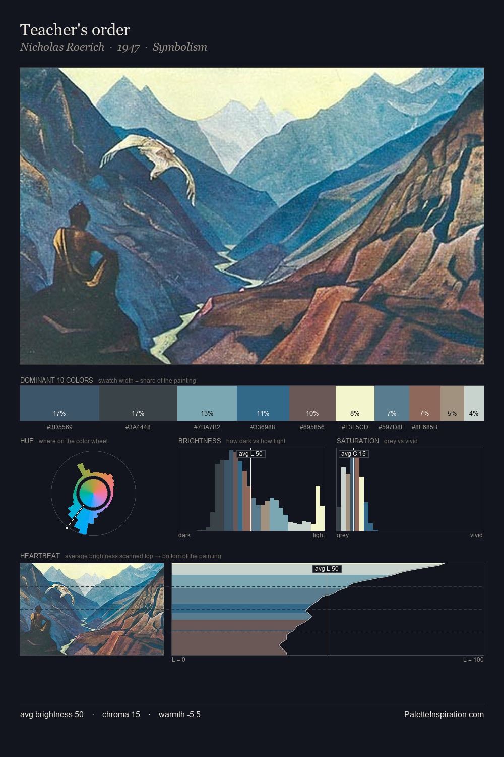
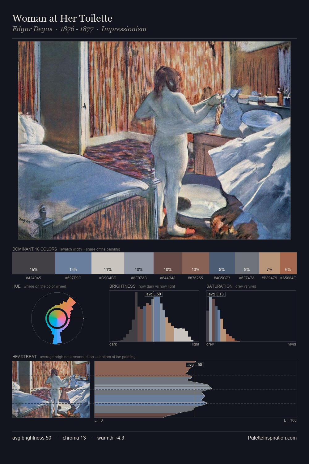
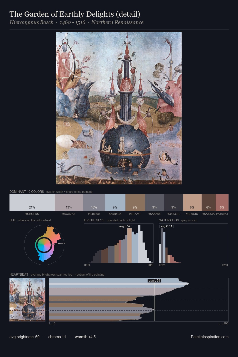
Values in Amrita Sher-Gil rest in the mid-range - neither dramatically lit nor steeped in shadow. Blues and teal-greys govern the palette, lending it an aquatic or atmospheric quality. Chroma hovers near zero; colour declares itself through subtle shifts in hue rather than outright saturation. #AC6D67 delivers the chromatic peak at only 3.1% - a small shot of colour with outsized visual impact. At 51 units across the value scale, the palette keeps contrast readable without letting it dominate. The mid-to-high key, cool bias, and moderate chroma point to outdoor observation - sky and diffused daylight as the dominant light source. In the context of Amrita Sher-Gil's full range of palettes, group 4 represents one movement in an ongoing chromatic dialogue.
Example use cases
- museums & galleries
- academic publishing
- heritage brands
- auction houses
- exhibition design
I Love This!
Copy, export, or download for your project