Amrita Sher-Gil Palette 2
Pale Vermillion
Pale High-key and low-chroma - delicate, bleached, washed with light.
Vermillion Brilliant red-orange - the classic mercury sulfide pigment, vivid and warm.

Palette Analysis
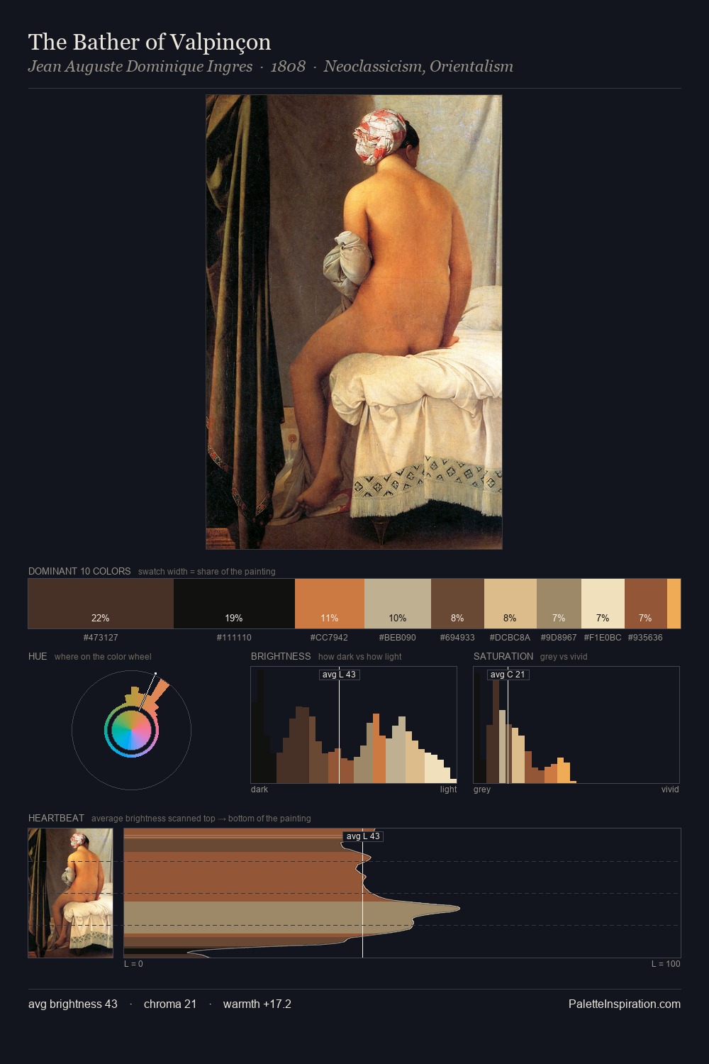
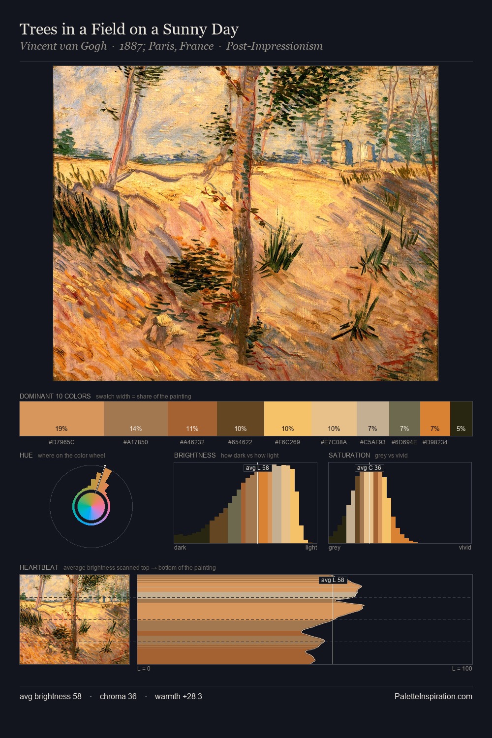
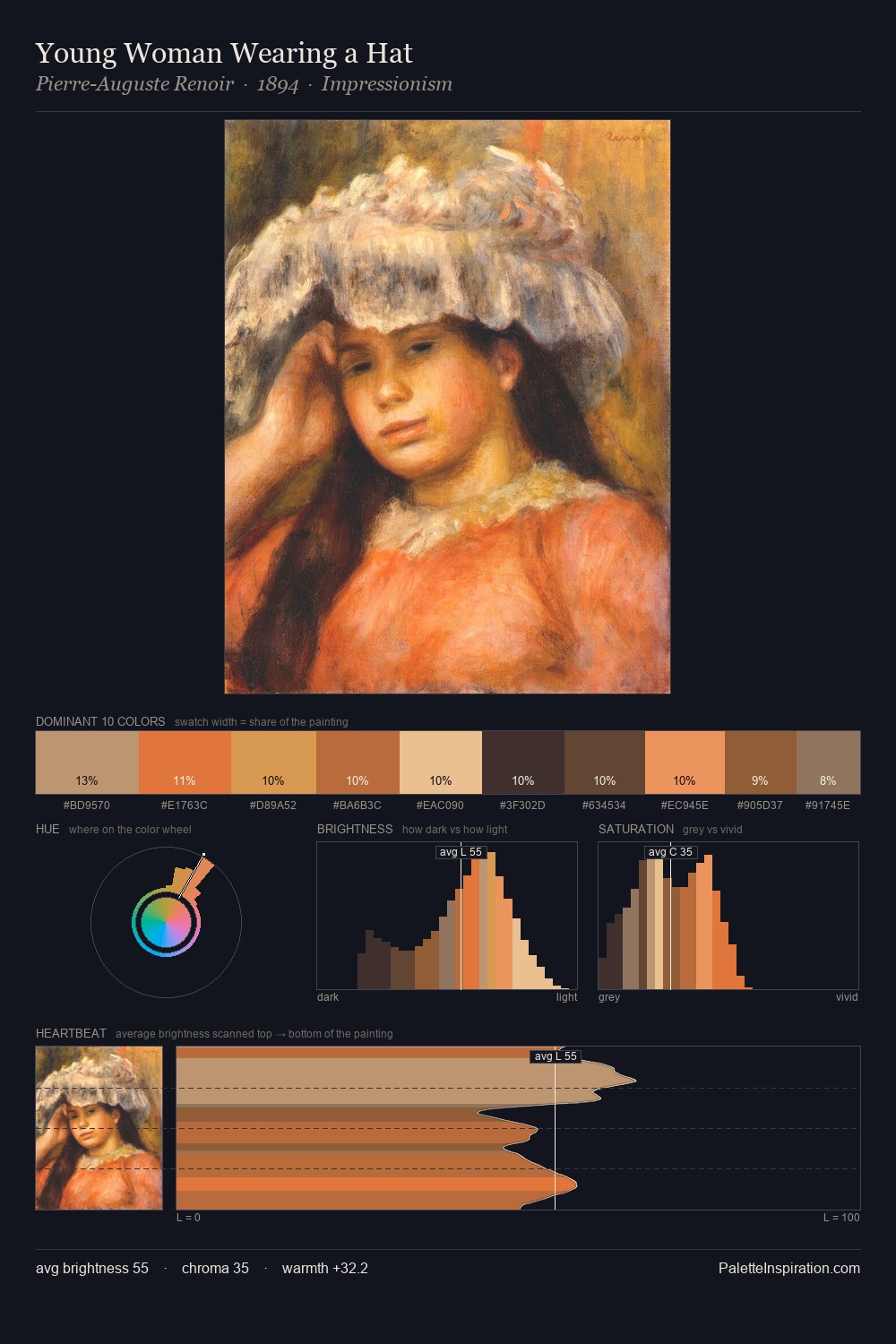
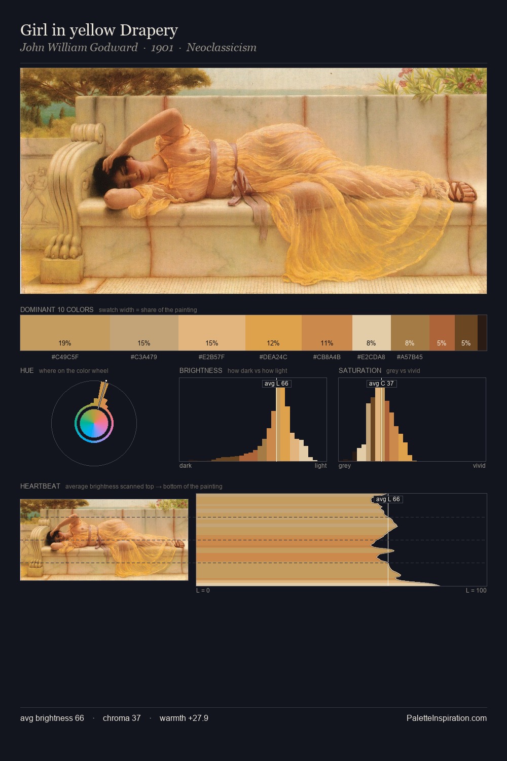
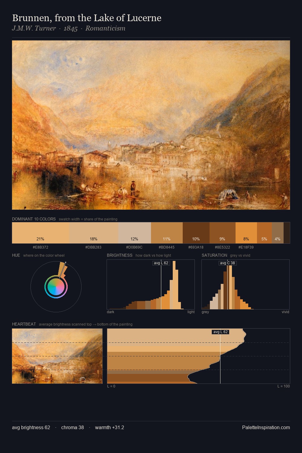
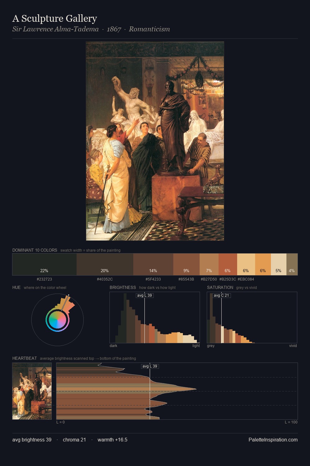
Amrita Sher-Gil occupies the comfortable middle of the value scale, avoiding both extremes to hold the eye in a sustained middle grey. The dominant temperature is warm, with earth tones and fire-hues setting the emotional key. A restrained, mid-chroma palette: every hue is present and legible, but nothing shouts. The most saturated colour, #F2C089, is reserved to 4.8% of the surface, where it acts as a focal punctuation. Value range is moderate at 46 units - enough contrast for legibility, not so much as to fragment the tonal unity. Amrita Sher-Gil's palette 2 carries its own internal logic while remaining in conversation with the artist's broader colour intelligence.
Example use cases
- publishing
- corporate identity
- consumer apps
- hospitality
- design agencies
I Love This!
Use This Palette
Copy, export, or download for your project
Copy, export, or download for your project
Copy:
Download:
Share: