Amadeo de Souza-Cardoso Palette 6

Palette Analysis
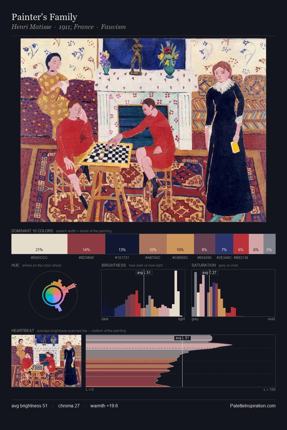
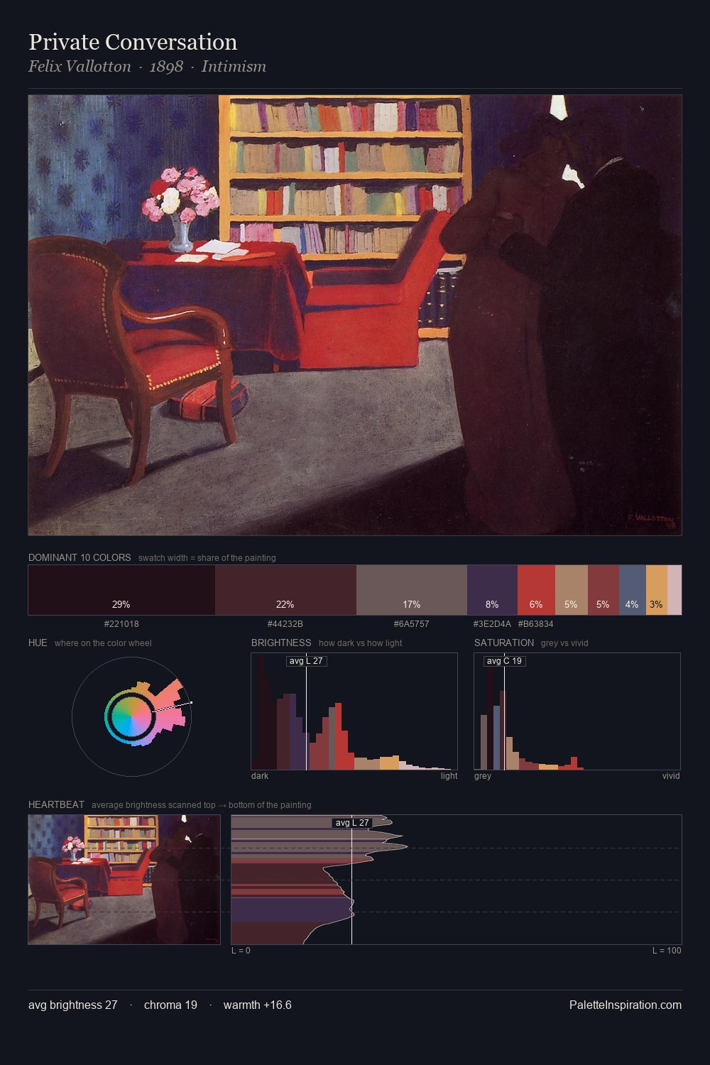
Mid-key values give Amadeo de Souza-Cardoso its characteristic quietness - nothing blazes, nothing disappears. Neither warm nor cool has the upper hand here; the equilibrium between the two generates the palette's visual energy. Chroma is moderate: colours carry enough saturation to be read as colour, but the palette stops well short of garish intensity. #212645 at 27.3% of the palette: an overwhelming presence that pulls all other colours into its gravitational field. The highest-chroma note - #CE8446 - appears at just 7.4%, deployed as a precision accent against the quieter ground. Value range is moderate at 51 units - enough contrast for legibility, not so much as to fragment the tonal unity. The palette reads as an Impressionist one - light-biased, chromatically direct, and built on temperature contrast rather than value opposition. Palette 6 sits within the larger chromatic argument that Amadeo de Souza-Cardoso's complete body of work advances.
Example use cases
- ceramics & pottery
- boutique hospitality
- menswear
- heritage food brands
- craft & artisan brands
I Love This!
Copy, export, or download for your project