Amadeo de Souza-Cardoso Palette 3

Palette Analysis
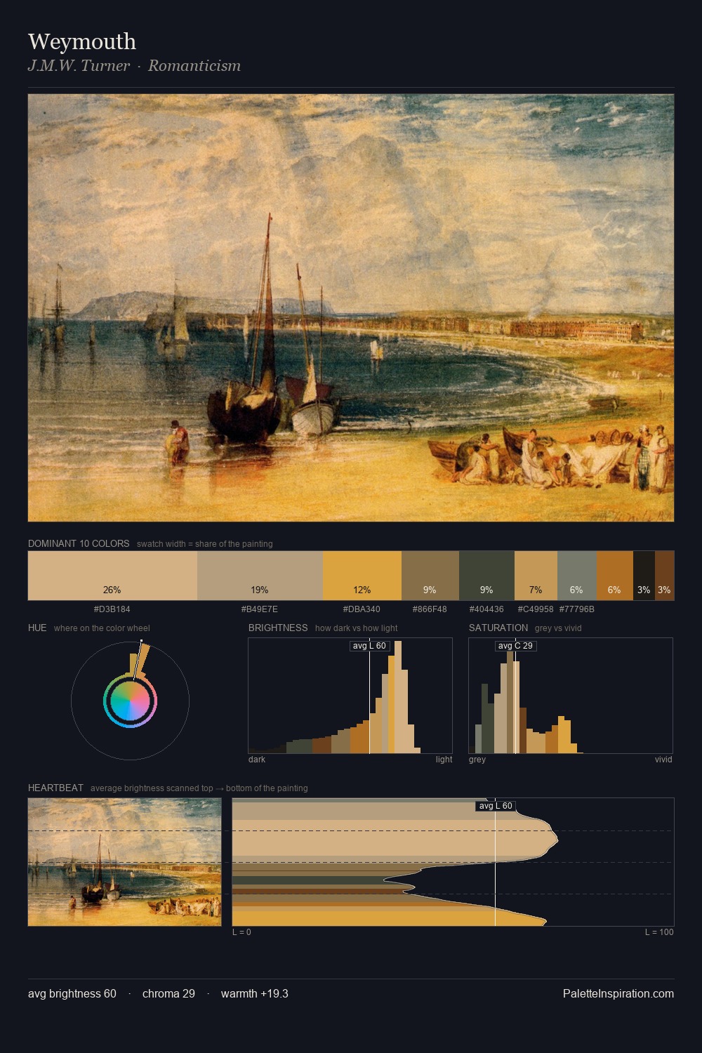
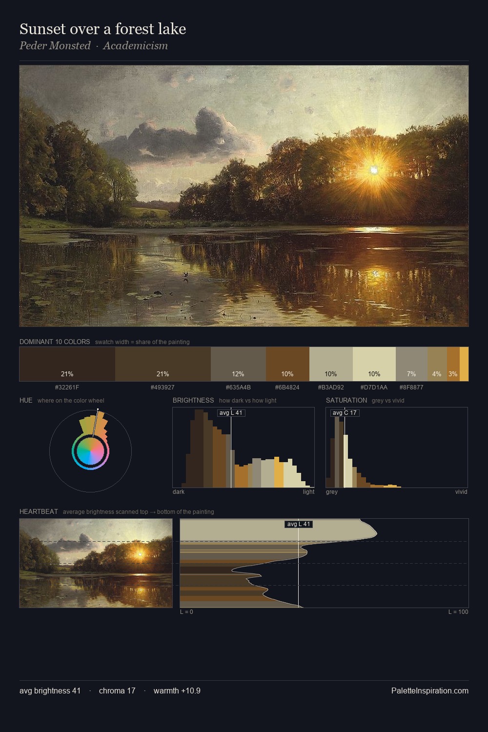
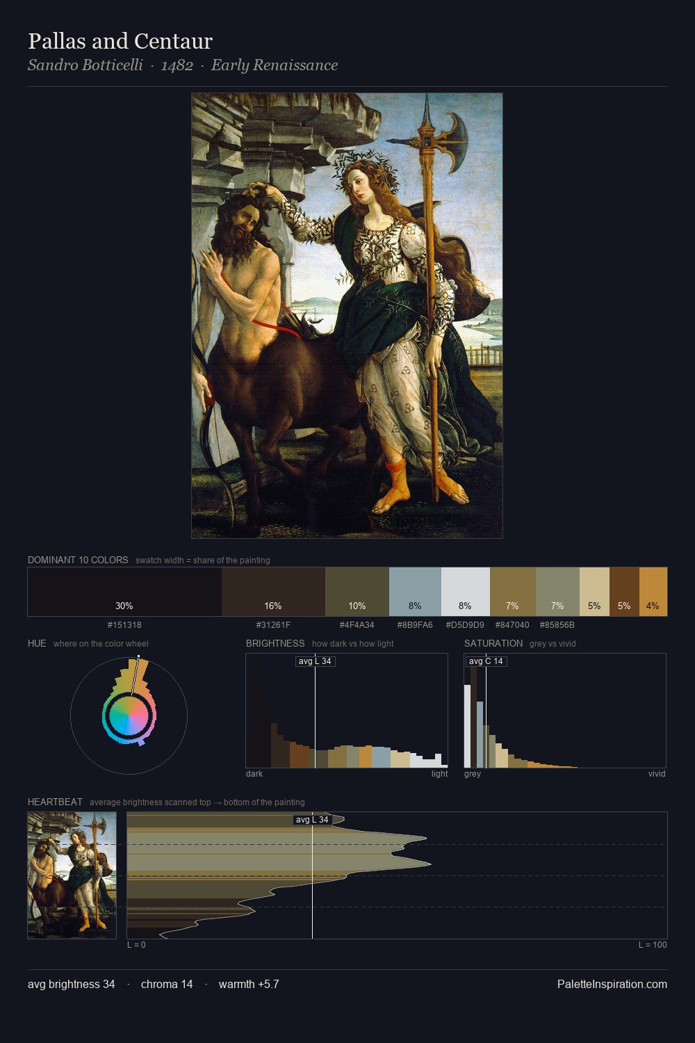
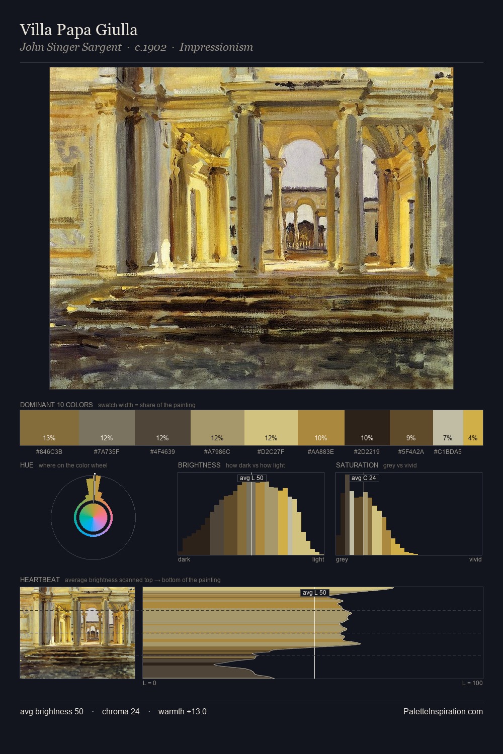
Amadeo de Souza-Cardoso occupies the comfortable middle of the value scale, avoiding both extremes to hold the eye in a sustained middle grey. Cool tones set the register here - the blues and greens easily outweigh any warm accents. Chroma is moderate: colours carry enough saturation to be read as colour, but the palette stops well short of garish intensity. The saturated accent, #71492A, registers at 4.8% - sparse enough to feel like a deliberate surprise. 59 units of value range underpin the palette's structural clarity: the eye always knows where light falls. High luminosity and cool temperature suggest the plein-air condition: unfiltered daylight and open sky. Palette 3 sits within the larger chromatic argument that Amadeo de Souza-Cardoso's complete body of work advances.
Example use cases
- interior design
- furniture brands
- cookbook publishing
- wine & spirits
- food packaging
I Love This!
Copy, export, or download for your project