Alexej von Jawlensky Palette 2

Palette Analysis
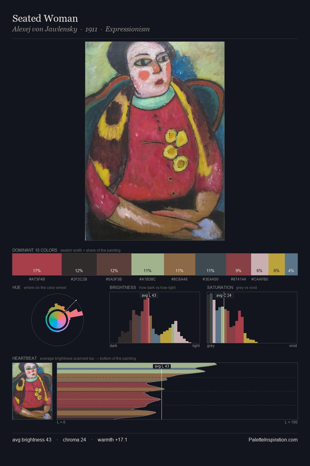
Alexej von Jawlensky occupies the comfortable middle of the value scale, avoiding both extremes to hold the eye in a sustained middle grey. Alexej von Jawlensky keeps warm and cool in parity, a balance that lends the work a perceptual shimmer. All colours lean toward grey, building depth through value rather than colour punch. The dominant colour, #393C42, takes 25.1% of the total area, establishing the overall mood before any other hue is introduced. Only 7.8% is devoted to #916D51, yet that small allocation delivers the palette's entire chromatic tension. 48 units of value spread create a palette that is varied but unified - contrast in the service of harmony. This is palette 2 of Alexej von Jawlensky's sequence - a single chapter in a chromatic story told across many works.
Example use cases
- boutique hospitality
- film production
- menswear
- art prints & posters
- heritage brands
I Love This!
Copy, export, or download for your project