Aleksey Antropov Palette 5

Palette Analysis
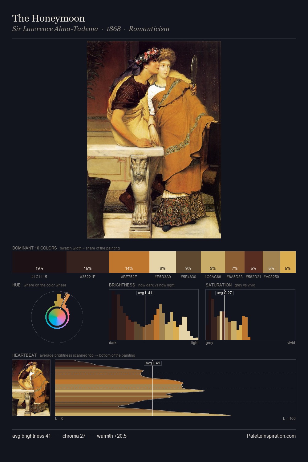
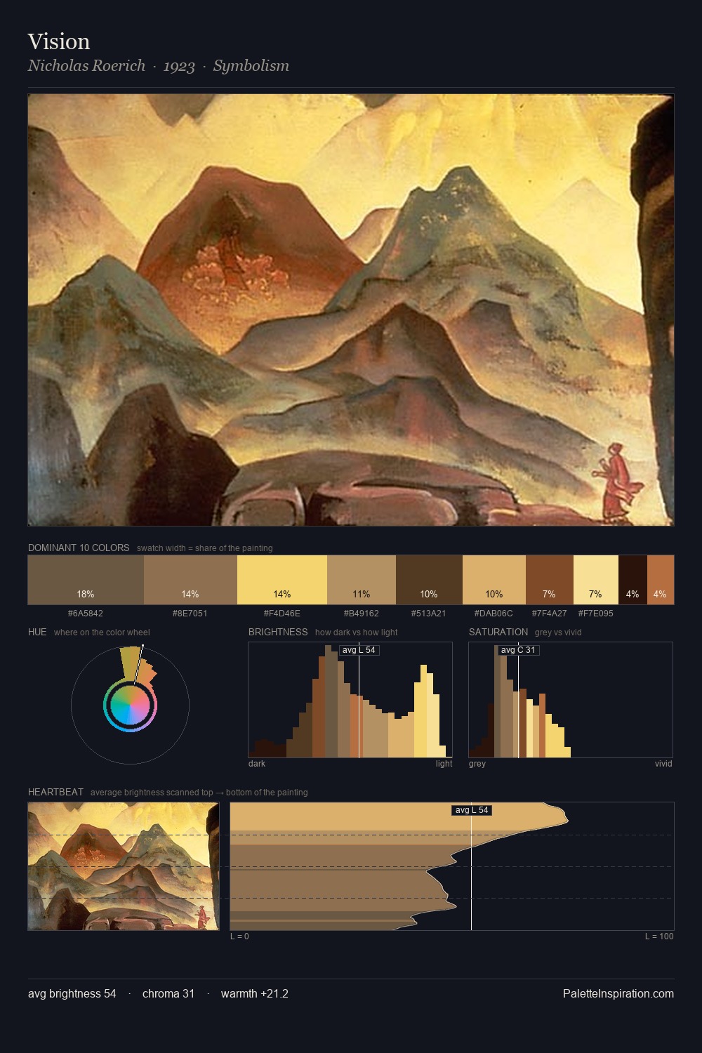
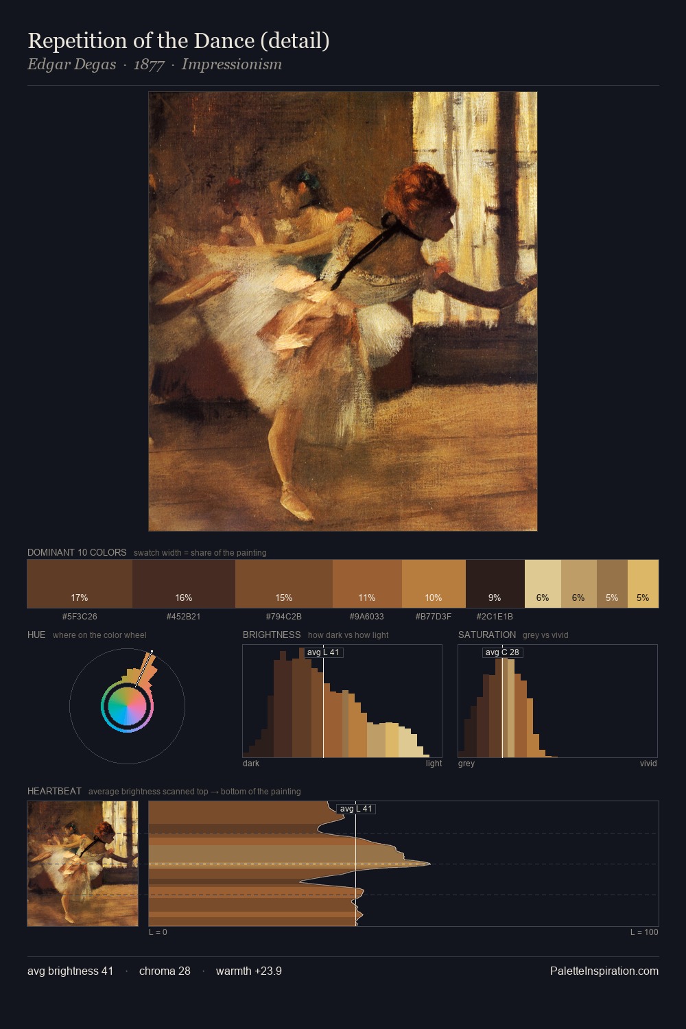
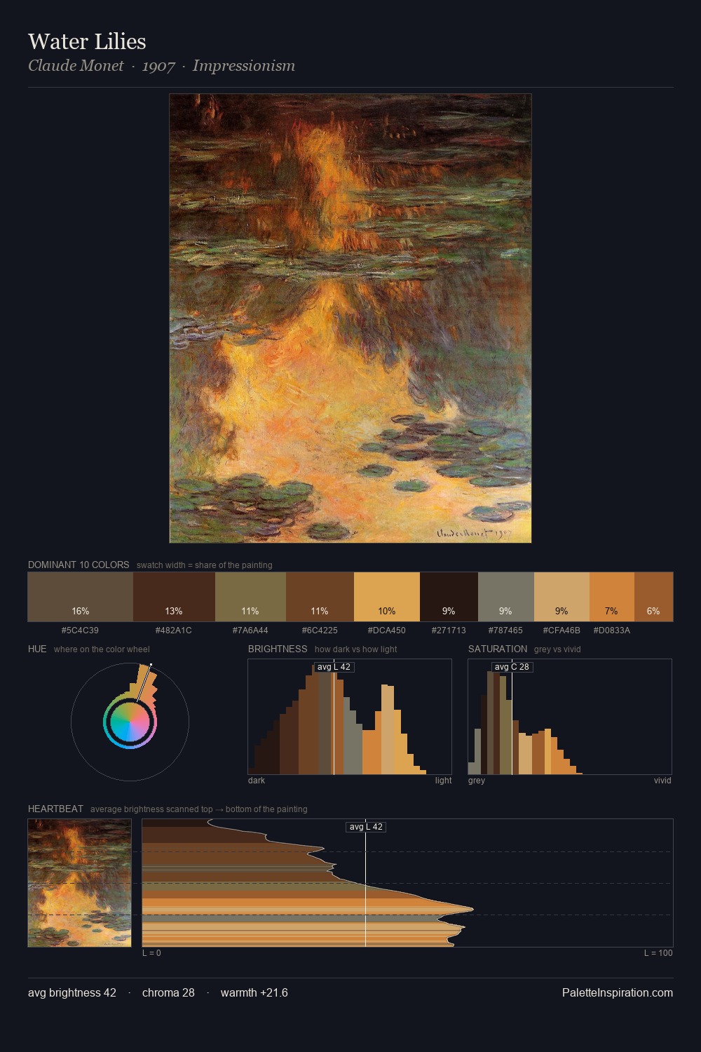
Darkness anchors Aleksey Antropov; light is rationed, creating dramatic contrast rather than open air. Yellow, ochre, sienna: warm hues that Aleksey Antropov deploys as the palette's primary energy. Chroma hovers near zero; colour declares itself through subtle shifts in hue rather than outright saturation. The dominant colour, #150912, takes 31.8% of the total area, establishing the overall mood before any other hue is introduced. The most saturated colour, #F5C862, is reserved to 1.1% of the surface, where it acts as a focal punctuation. A value spread of 69 units gives the palette both depth and air - shadows are genuinely dark, lights genuinely light. This tonal restraint is characteristic of the Aleksey Antropov approach: colour serves light, not the reverse. Aleksey Antropov's palette 5 carries its own internal logic while remaining in conversation with the artist's broader colour intelligence.
Example use cases
- theater design
- jewelry brands
- tobacco-adjacent retail
- event branding
- film & entertainment
I Love This!
Copy, export, or download for your project