Alberto Vargas Master Palette

Palette Analysis
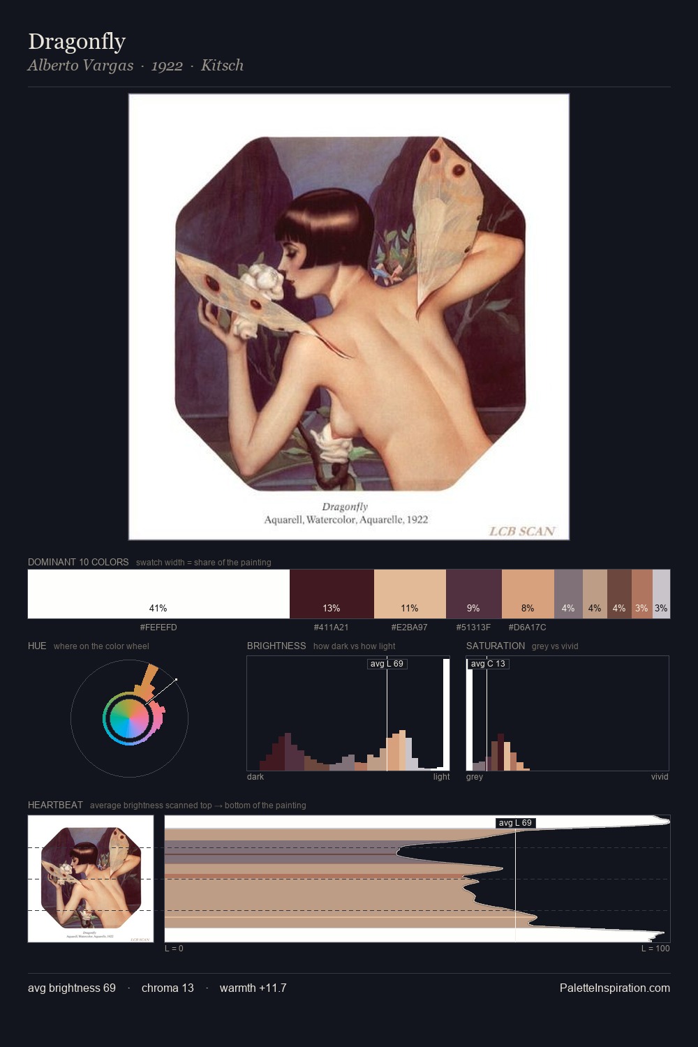
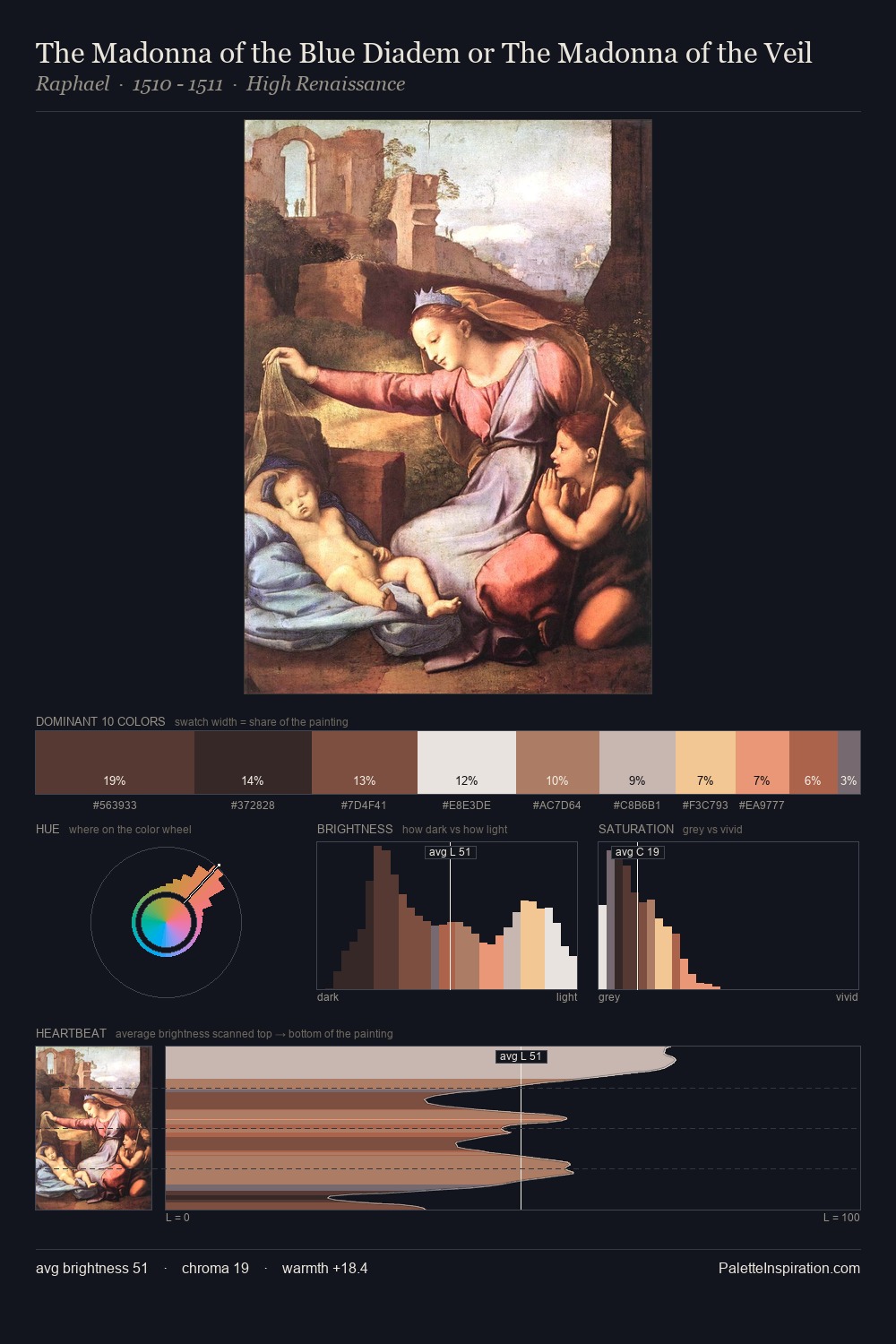
Alberto Vargas occupies the comfortable middle of the value scale, avoiding both extremes to hold the eye in a sustained middle grey. Warm hues command this palette; Alberto Vargas favours the reds, oranges, and yellows of firelight and earth. Saturation is deliberately withheld - the beauty here lies in the near-monochromatic gradations rather than colour difference. A single dominant - #E6BB98 at 30.2% - sets the character of the whole composition. The highest-chroma note - #BF6950 - appears at just 3.6%, deployed as a precision accent against the quieter ground. The value range spans 77 units across the palette, providing the full gamut from deep shadow to near-white and ensuring clear tonal hierarchy. These proportions encode Alberto Vargas's instinctive sense of how much of each quality the eye can hold.
Example use cases
- ceramics & pottery
- boutique hospitality
- menswear
- heritage food brands
- craft & artisan brands
I Love This!
Copy, export, or download for your project