Albert Bierstadt Palette 2

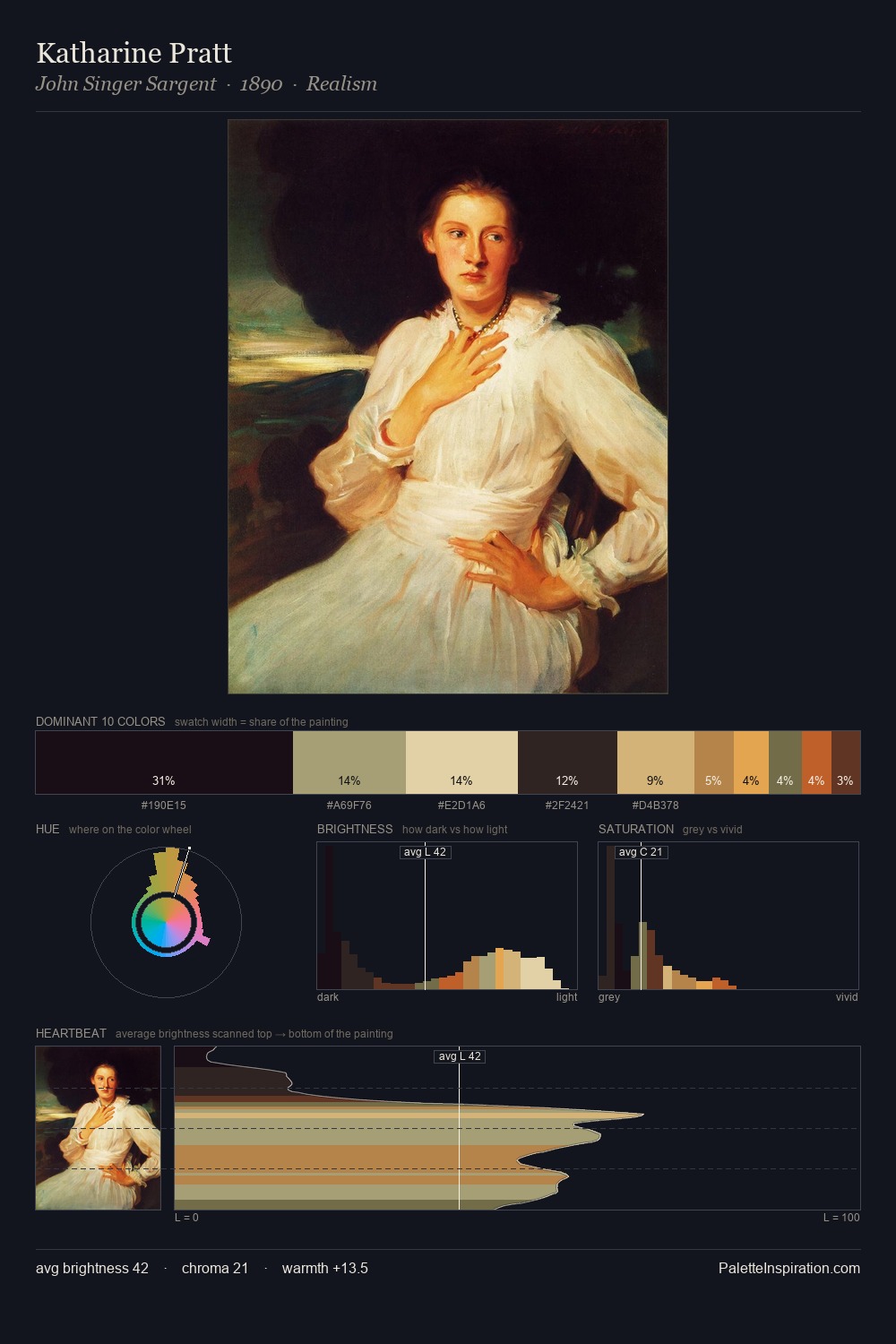
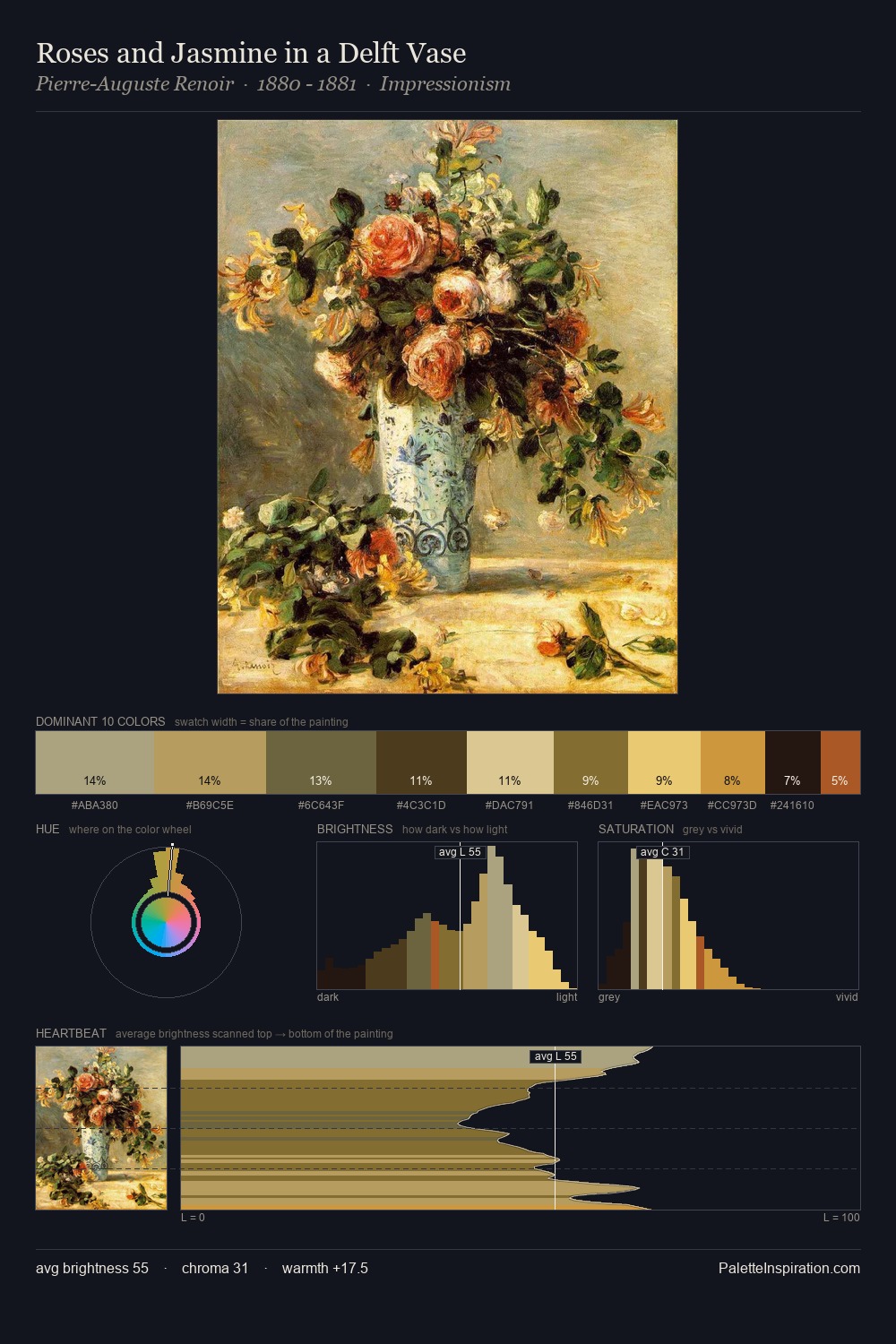
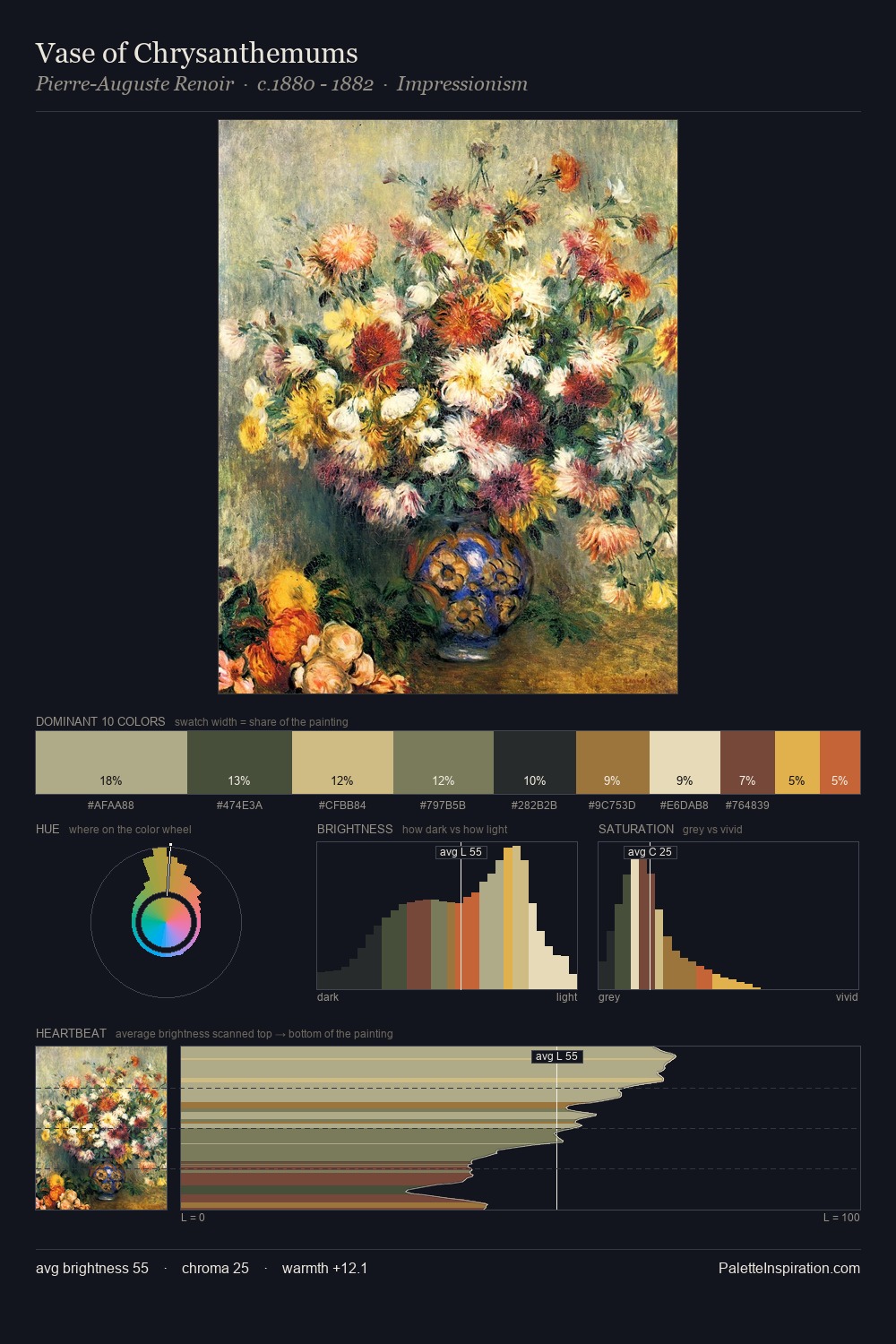
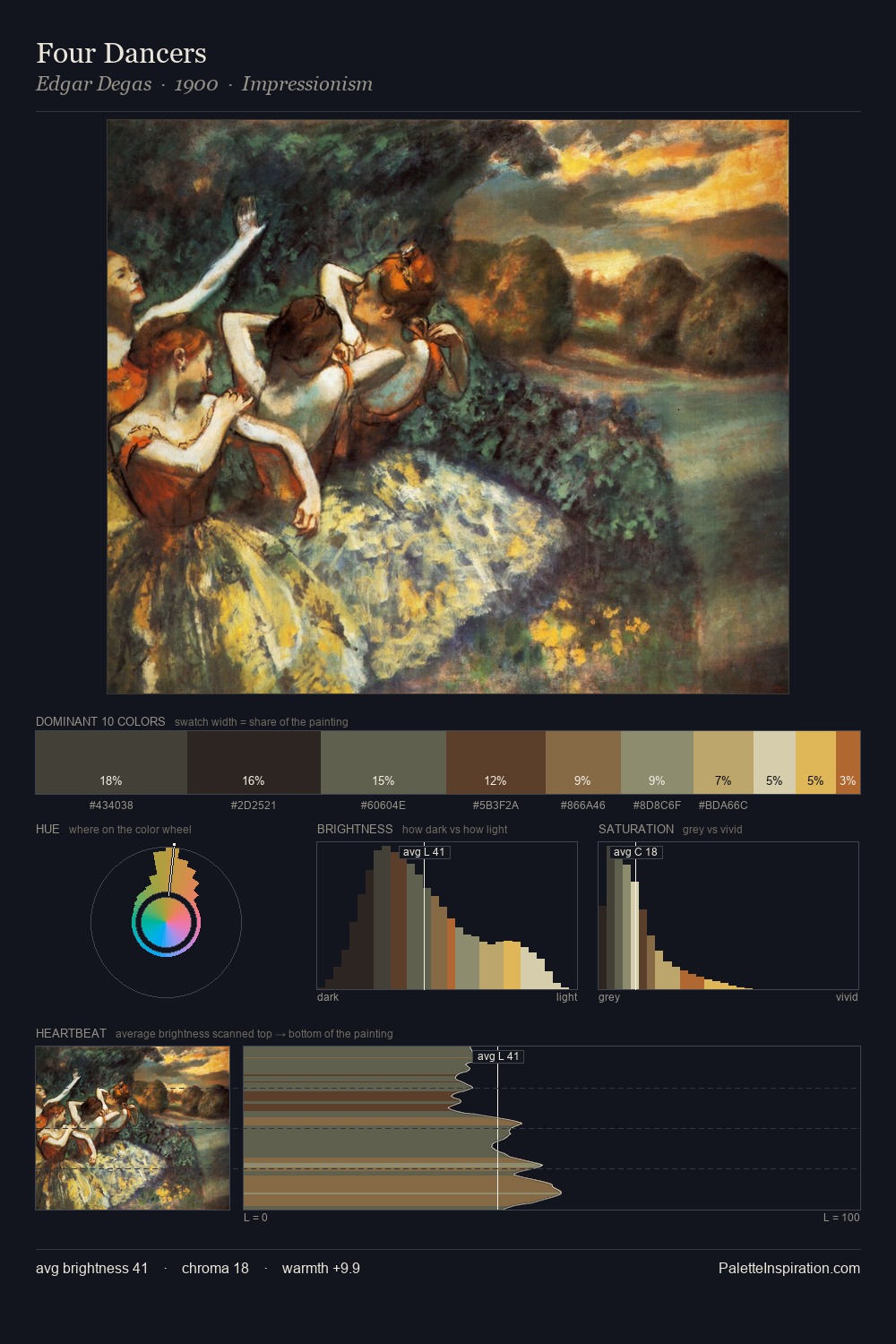
Palette Analysis
Albert Bierstadt occupies the comfortable middle of the value scale, avoiding both extremes to hold the eye in a sustained middle grey. Blues and teal-greys govern the palette, lending it an aquatic or atmospheric quality. Saturation is measured and controlled, giving the palette presence without visual aggression. #DDCC9D functions as the palette's exclamation mark: highest chroma, lowest percentage (6.5%). A value spread of 59 units gives the palette both depth and air - shadows are genuinely dark, lights genuinely light. The palette has the character of outdoor light: cool, mid-bright, with colour rendered faithfully rather than expressively. Palette 2 sits within the larger chromatic argument that Albert Bierstadt's complete body of work advances.
Example use cases
- ceramics & pottery
- boutique hospitality
- menswear
- heritage food brands
- craft & artisan brands
I Love This!
Copy, export, or download for your project