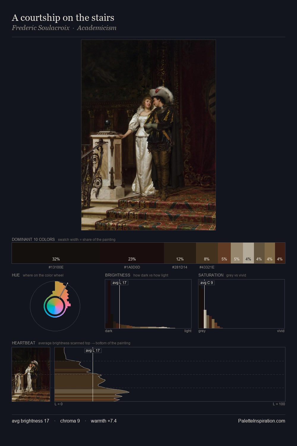
Adolph Tidemand Palette 5

Palette Analysis
Adolph Tidemand occupies the comfortable middle of the value scale, avoiding both extremes to hold the eye in a sustained middle grey. Warm and cool tones are held in careful balance - neither family dominates, creating tension and resolution simultaneously. Saturation is deliberately withheld - the beauty here lies in the near-monochromatic gradations rather than colour difference. #625539 at 56.0% of the palette: an overwhelming presence that pulls all other colours into its gravitational field. #321F16 delivers the chromatic peak at only 6.2% - a small shot of colour with outsized visual impact. Spanning 29 units on the value axis, the palette achieves the balance between tonal flatness and fragmentation. Palette 5 sits within the larger chromatic argument that Adolph Tidemand's complete body of work advances.
Example use cases
- theater design
- jewelry brands
- tobacco-adjacent retail
- event branding
- film & entertainment
I Love This!
Copy, export, or download for your project