Adam van der Meulen Palette 1
Muted Parchment
Muted Deliberately desaturated - chroma pulled toward gray, the restraint of tonal painting.
Parchment Aged warm neutral - the color of old manuscript parchment, tan and slightly yellowed.

Palette Analysis
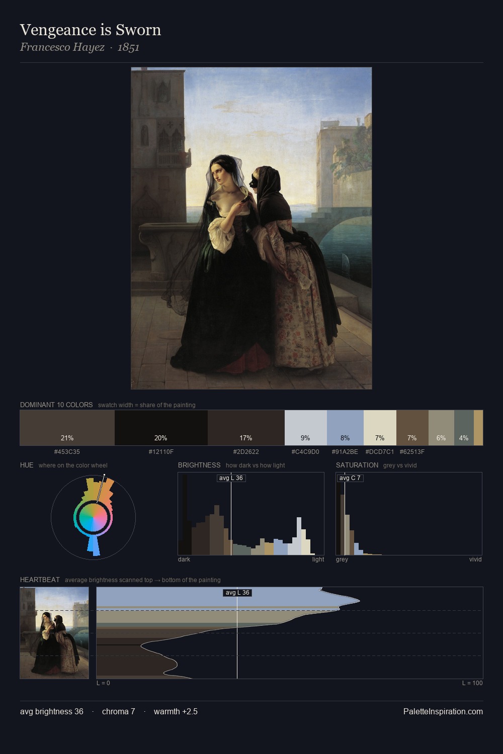
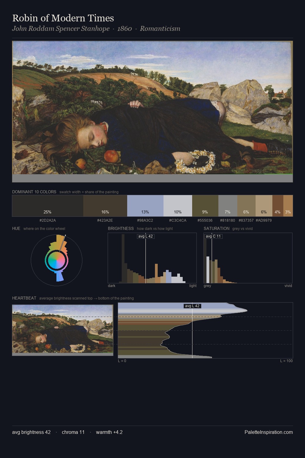
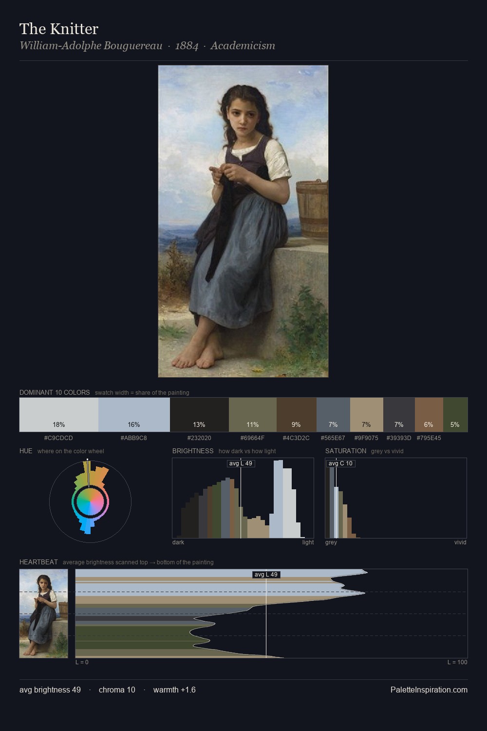
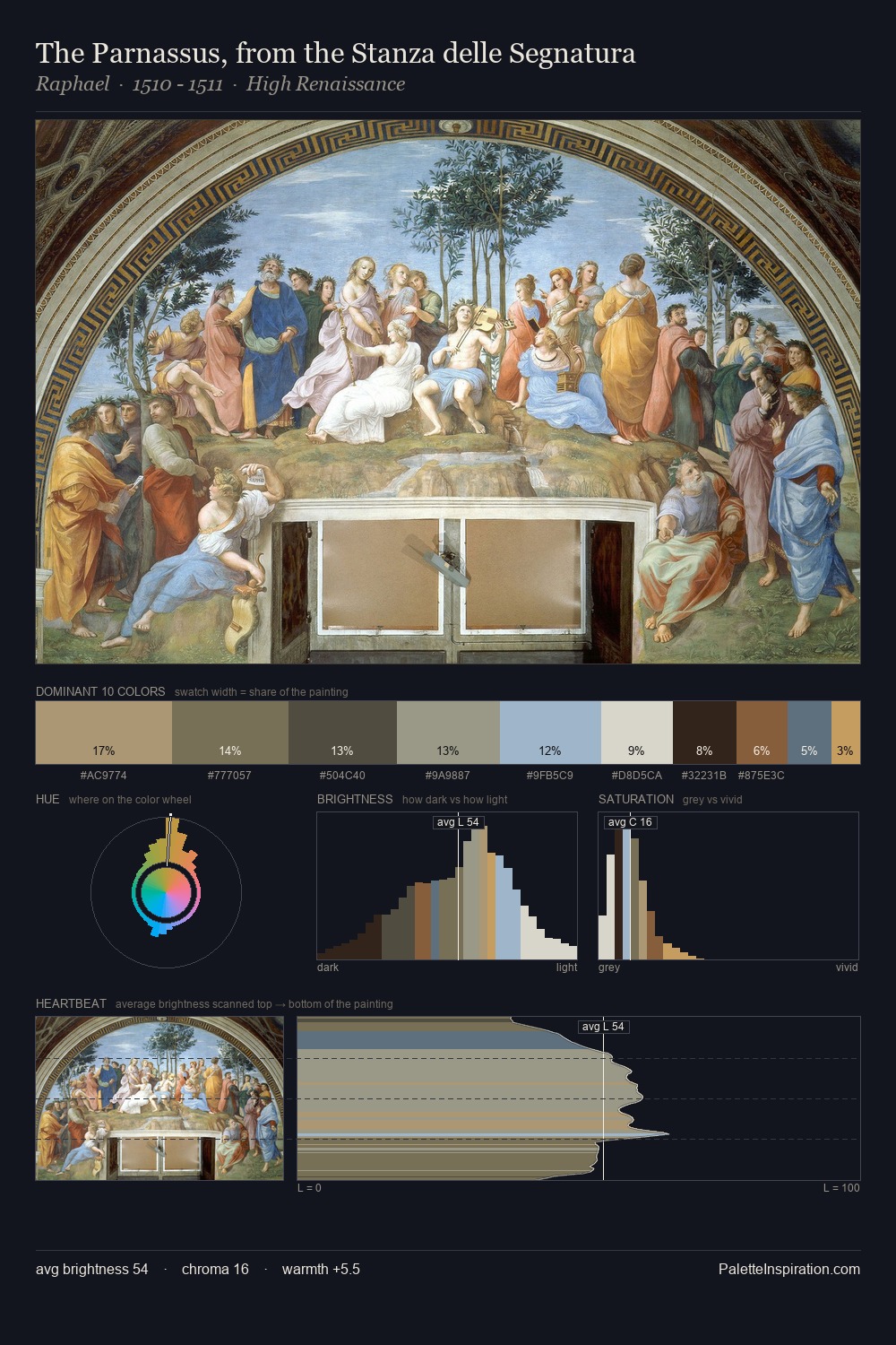
The value structure of Adam van der Meulen is mid-key: quiet, controlled, and cohesive. Neither warm nor cool has the upper hand here; the equilibrium between the two generates the palette's visual energy. Muted throughout, the palette achieves its effects through value and temperature rather than chromatic force. The most saturated colour, #B6CEDA, is reserved to 8.1% of the surface, where it acts as a focal punctuation. 60 units of value range underpin the palette's structural clarity: the eye always knows where light falls. Adam van der Meulen's palette 1 carries its own internal logic while remaining in conversation with the artist's broader colour intelligence.
Example use cases
- exhibition design
- foundation branding
- estate management
- art education
- museums & galleries
I Love This!
Use This Palette
Copy, export, or download for your project
Copy, export, or download for your project
Copy:
Download:
Share: