Abraham van Beyeren Palette 2

Palette Analysis
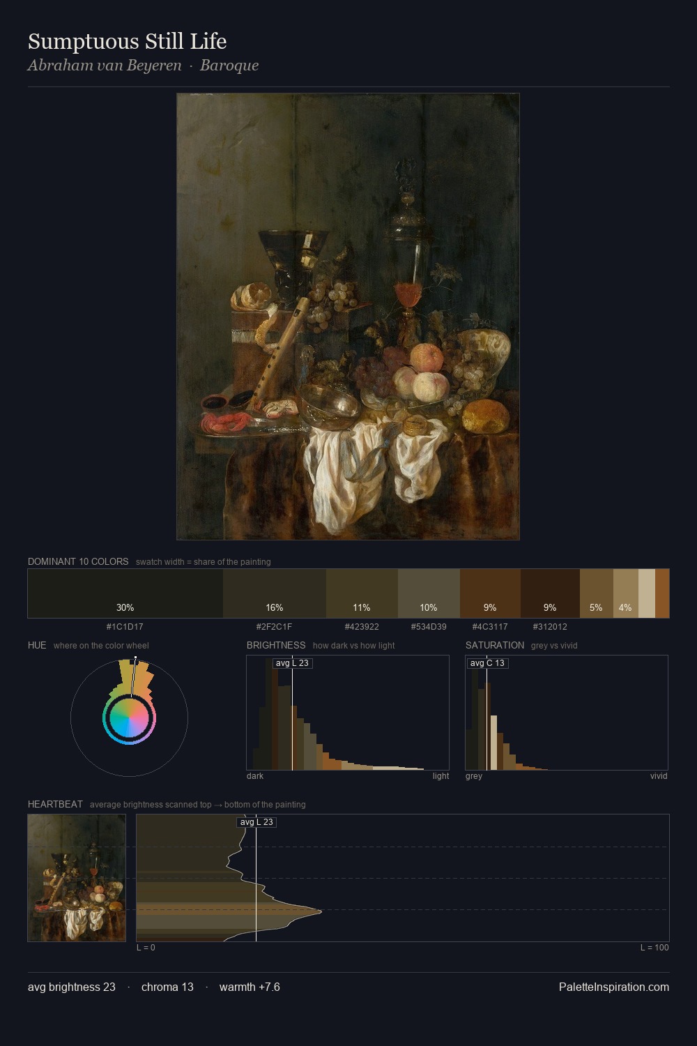
Abraham van Beyeren dwells firmly in the shadows, with no more than a whisper of light. Abraham van Beyeren tilts toward cool - blues and silver-greys carry the structural weight. Saturation is deliberately withheld - the beauty here lies in the near-monochromatic gradations rather than colour difference. At 29.9%, #1D1E17 functions less as a colour accent and more as a complete atmospheric environment. The most saturated colour, #463118, is reserved to 10.9% of the surface, where it acts as a focal punctuation. The value range spans 59 units across the palette, providing the full gamut from deep shadow to near-white and ensuring clear tonal hierarchy. This tonal restraint is characteristic of the Abraham van Beyeren approach: colour serves light, not the reverse. In the context of Abraham van Beyeren's full range of palettes, group 2 represents one movement in an ongoing chromatic dialogue.
Example use cases
- theater design
- jewelry brands
- tobacco-adjacent retail
- event branding
- film & entertainment
I Love This!
Copy, export, or download for your project